01
Photos placed like a scrapbook
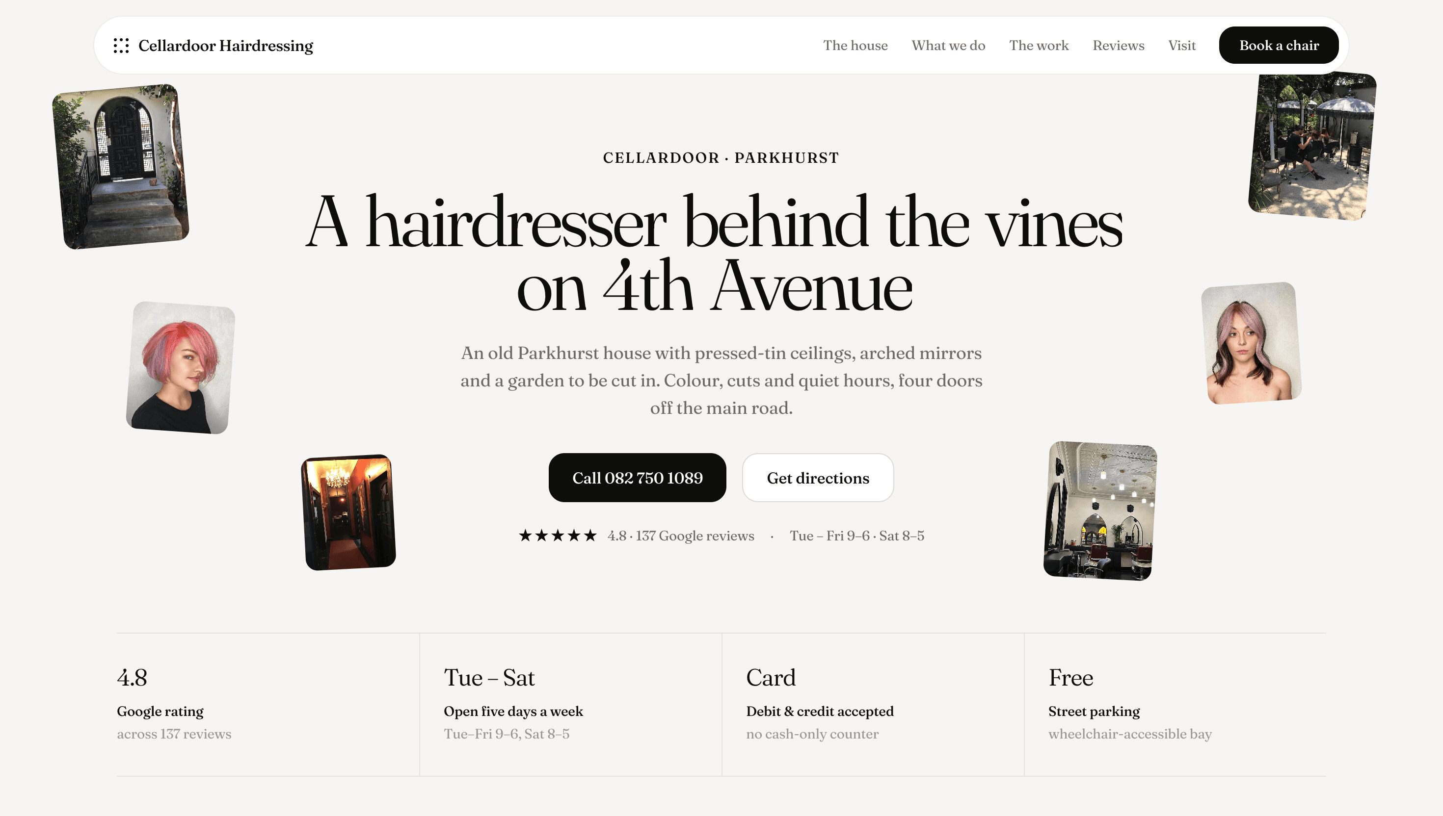
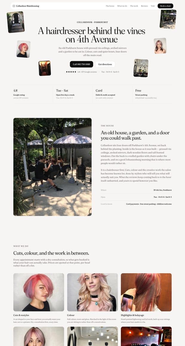
Small portraits of the colour work are scattered around the hero headline, so the first screen shows both the salon's style and its results.
A website for a hairdresser in an old house on Parkhurst's 4th Avenue — pressed-tin ceilings, arched mirrors and a garden to be cut in. Built to feel as calm as the salon, and to make booking a single call.
Cellardoor sits four doors off the main road, set back behind the planting — easy to walk past. It's known for creative colour and for unhurried appointments, inside or out in the walled garden. The site had to capture that atmosphere, show the colour work the salon is known for, and explain that booking is by phone or WhatsApp, with a consultation first.
What the site has to do
Set the mood first. The house, the garden and the black door come before the services, because that's what the reviews keep mentioning.
Show the colour. Rose, copper and pastel work gets its own gallery — “The wall” — because creative colour is what the salon is known for.
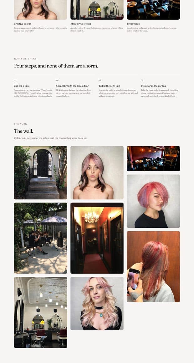
Explain how a visit runs. Four steps, and none of them are a form: call, come through the black door, talk it through, inside or in the garden.
Honest pricing. Prices are quoted at the consultation, per head, and the site says so rather than listing numbers that don't apply.
An almost monochrome palette — warm linen, near-black ink and soft stone greys — lets the photographs of colour work carry all the colour on the page. It reads like a well-made print magazine, which suits a salon with a garden and pressed-tin ceilings.
Linen
#F7F5F3
Page background
Ink
#0D0D0D
Headings, buttons, review card
Paper
#FFFFFF
Cards
Stone
#6E6A69
Body text
Pebble
#9A9796
Labels and captions
Fraunces does everything, at a light weight for the large headlines and regular for the body. A soft, slightly old-fashioned serif fits an old house and a slow appointment far better than a clean sans would, and it makes the page feel editorial rather than like a booking app.
01
Small portraits of the colour work are scattered around the hero headline, so the first screen shows both the salon's style and its results.
02
Each service is described in a sentence about how it's done — dry consultation first, colour matched in the room's light — instead of a price list.
03
“The wall” collects the salon's colour work and the house itself in an uneven grid, like photos pinned up in the salon.
04
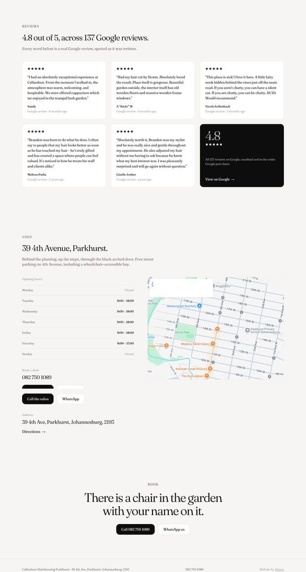
The page closes on “There is a chair in the garden with your name on it,” with the call and directions buttons right underneath.
Tell us what your business does and we'll come back with a scope, a fixed price, and a date.