01
Eight trades, one horizontal row
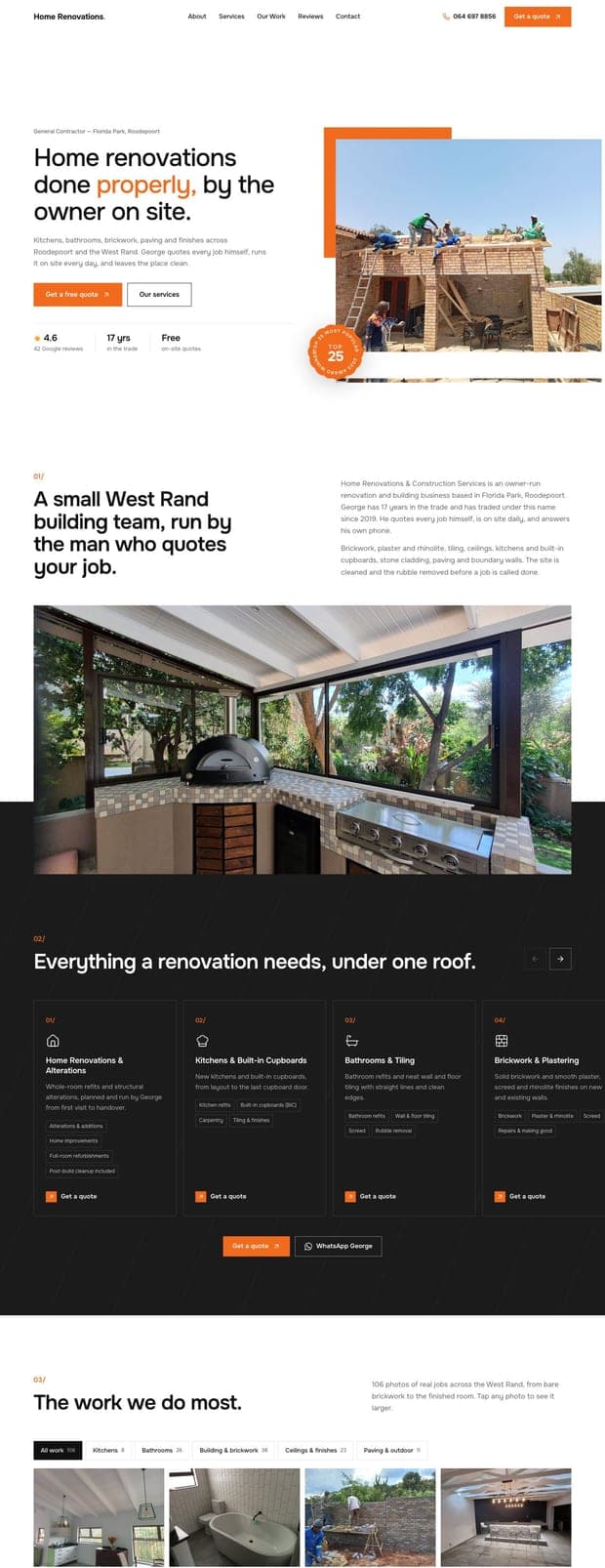
Renovations, kitchens, bathrooms, brickwork, ceilings, paving, stone cladding and boundary walls. The row scrolls sideways with square arrows, so eight services take the space of four without a wall of text.
A new home online for George's building team in Florida Park. Built to show the work, prove the reputation, and turn a Google search into a phone call.
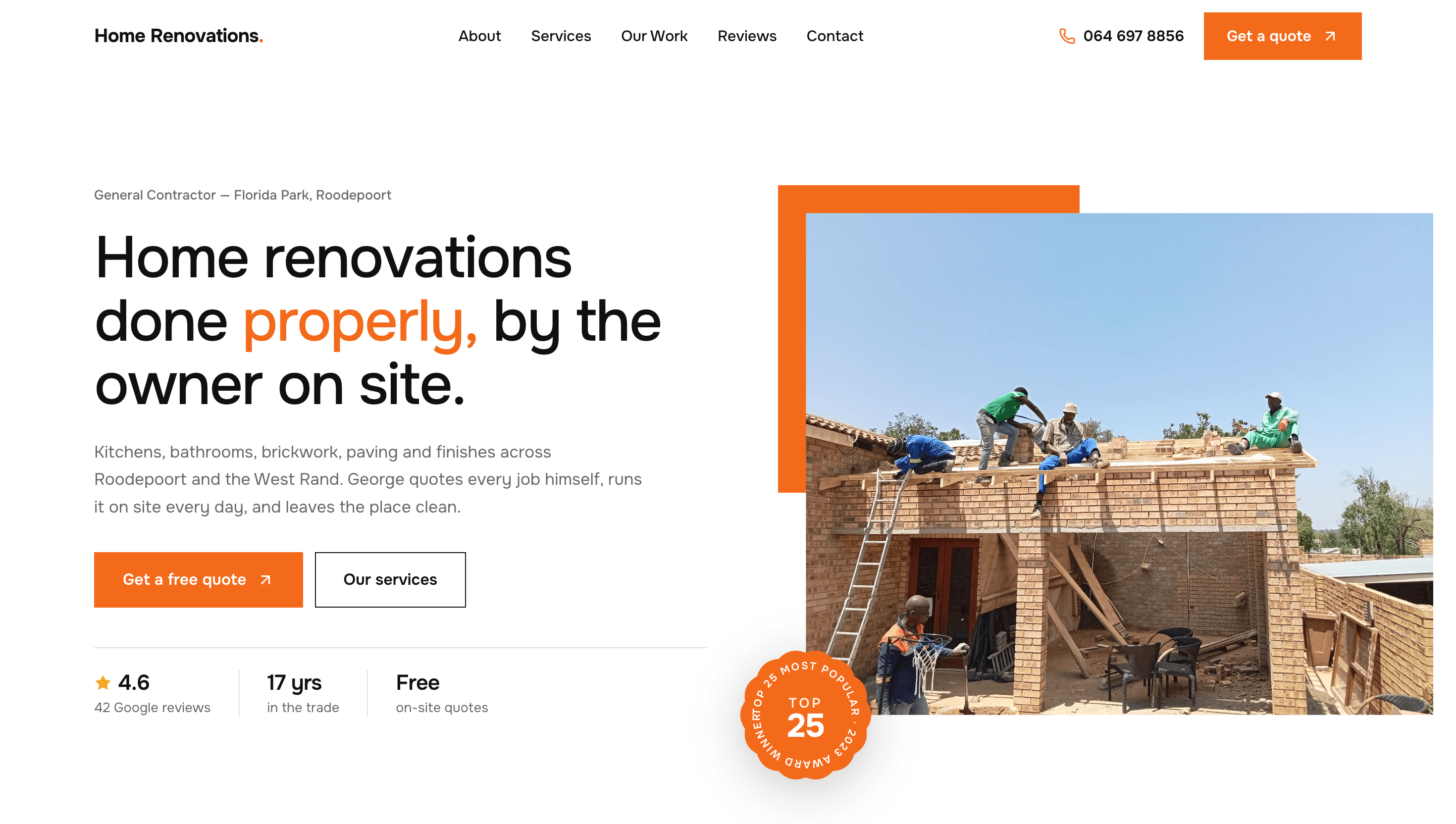
Home Renovations & Construction Services has built a real reputation in Roodepoort: 42 Google reviews at 4.6 stars, roughly triple the review count of any other building contractor in our Johannesburg search, plus a Top 25 Most Popular award in 2023. Until now all of that lived on a Google listing George does not own. The site's job is to hold that reputation in one place, show the work, and make the phone ring.
What the site has to do
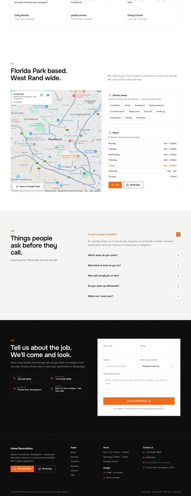
Drive contact. Call and WhatsApp reachable from every screen, and a quote form that opens WhatsApp pre-filled.
Show the work. 106 of George's own project photos, filterable by trade. No stock photography anywhere.
Earn trust. Real Google reviews, the 4.6 rating, and the 2023 Top 25 award, all verifiable.
Get found. Built for “home renovations Roodepoort” searches, with structured data Google can read.
Own the ground. The Google listing can be renamed or suspended at any time. The website cannot.
Every competing contractor on the West Rand uses the same corporate blue. We went the other way: a clean white page, black for the sections that need weight, and one strong safety orange that does all the work. Orange is the colour of the trade already, on cones, vests and machinery, and it makes the site instantly recognisable in a row of search results. Every text and background pairing meets accessibility contrast guidelines.
Site Orange
#F26A1B
Buttons, links, accents, hover fills
Orange Deep
#D4560C
Pressed and hover states
Black
#0E0E0E
Services band, footer, quote form
Charcoal
#1B1B1B
Cards on the dark band
White
#FFFFFF
Page background, hero
Light Grey
#F4F4F2
Alternating sections
Hairline
#E2E2DF
Borders and dividers
Ink
#111111
Body text and headings
Onest is a modern geometric sans with a slightly squared feel that suits a building trade without shouting about it. Using a single family across headings, body and labels keeps the page calm and loads fast. Hierarchy comes from size and weight rather than from mixing typefaces, and the one orange word in each heading does the pointing.
01
Renovations, kitchens, bathrooms, brickwork, ceilings, paving, stone cladding and boundary walls. The row scrolls sideways with square arrows, so eight services take the space of four without a wall of text.
02
The card fills with the accent colour, the icon and chips turn white, and the arrow flips to black on white. Each card's Get a quote button drops that exact service into the enquiry form further down the page.
03
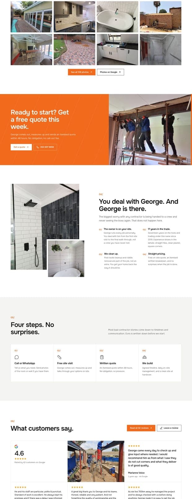
Every photo is one of George's own, taken from his Google listing. Filter by kitchens, bathrooms, building and brickwork, ceilings and finishes, or paving and outdoor. Twelve show at a time, and See all opens the lot.
04
A lightbox with arrow and keyboard navigation, a caption, a counter, and a Get a quote for this button that carries the trade straight into the form.
Tell us what your business does and we'll come back with a scope, a fixed price, and a date.