01
Rounds instead of sections
The page is split into Round 01 to Round 04 — food, pub, how it works, reviews — a small touch that makes the name part of the design.
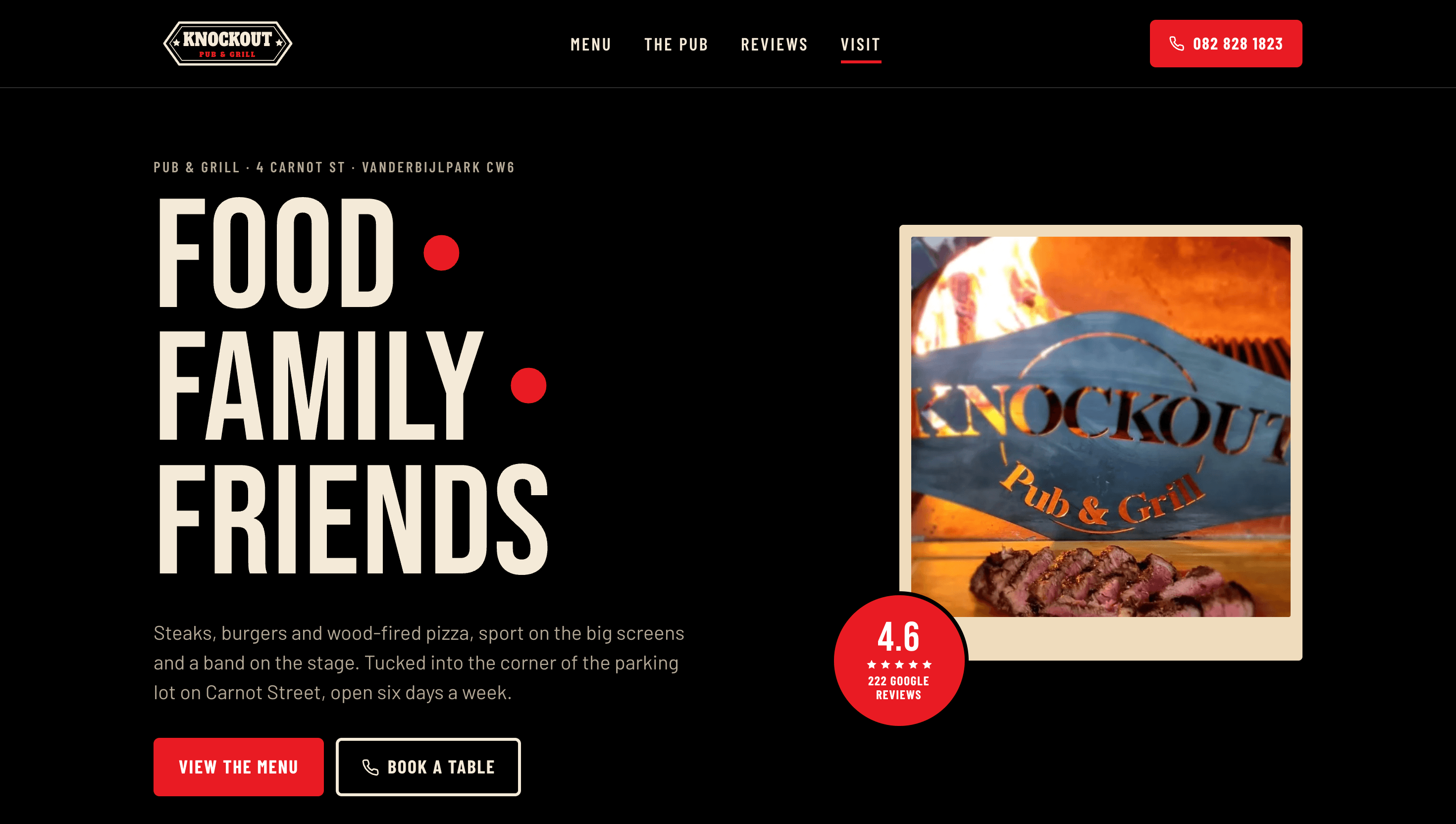
A website for a pub and grill on Carnot Street, Vanderbijlpark — steaks, burgers, wood-fired pizza, sport on the big screens and a band on the stage. Built to show that a plain door hides a great night out.
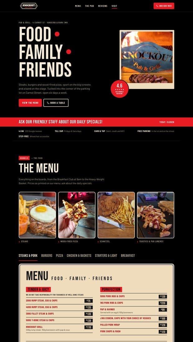
Knock Out sits in the corner of a parking lot, and the outside gives nothing away. Inside there's a long bar, big screens and a stage, with a menu that runs from a 9am breakfast to a heavyweight basket. The site had to put that whole menu online with prices, show off the room, and make booking a table for a group or a big match a single call.
What the site has to do
The full menu, online. Steaks, pork, burgers, pizza, baskets and breakfast, every item priced as on the boards.
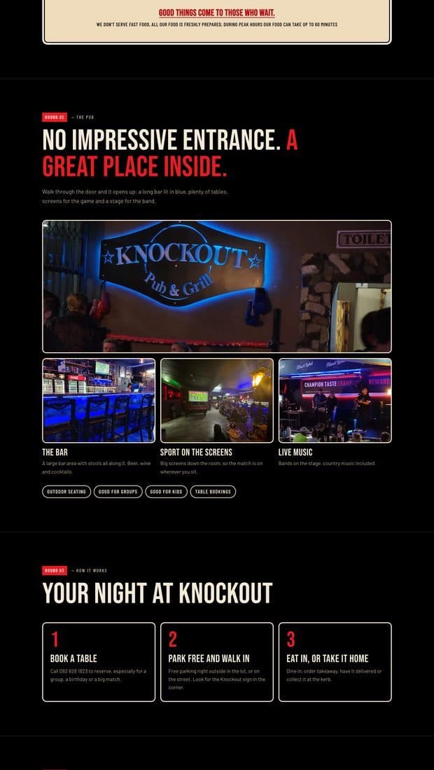
Sell the inside. “No impressive entrance. A great place inside.” — photos of the bar, the screens and the stage do the convincing.
Book the table. A three-step night: book, park free and walk in, eat in or take it home.
Set expectations. A plain note that food is made fresh and can take up to an hour at peak, so nobody's surprised.
The site borrows from the name: a black ground, a hard fight-poster red for buttons and labels, and a warm cream for the menu boards. It's loud on purpose — a pub with live music and sport on the screens shouldn't look like a fine-dining restaurant.
Black
#000000
Page background
Coal
#111111
Bands and cards
Red
#E91B23
Buttons, labels, specials bar
Red Dark
#B8121A
Prices and hover
Cream
#F4EAD8
Headings and body text
Paper
#EFDCBD
Menu boards
Muted
#B3A995
Secondary text
Line
#2B2B2B
Borders
Bebas Neue sets the headlines in tall uppercase, like the lettering on a fight poster, and Barlow Condensed carries the menu, labels and buttons — narrow enough to fit long dish names and prices on one line. The sections are numbered as rounds, from Round 01 to Round 04.
01
The page is split into Round 01 to Round 04 — food, pub, how it works, reviews — a small touch that makes the name part of the design.
02
The menu is set on cream boards with tabs for steaks, burgers, pizza and breakfast, readable on a phone without zooming.
03
A strip under the hero shows whether the pub is open today, beside the daily-specials reminder.
04
“Good things come to those who wait” — the hour-long peak warning is part of the menu, not hidden in small print.
Tell us what your business does and we'll come back with a scope, a fixed price, and a date.